Overview
Teachable is a leading online learning platform that empowers creators, educators, and entrepreneurs to build and monetize digital courses, coaching programs, and memberships.
As the platform expanded across multiple product surfaces, maintaining consistency and scalability became increasingly challenging. Layered Studio partnered with Teachable to consolidate fragmented Design System assets and create a stronger foundation for product consistency, collaboration, and long-term growth.
The Challenge
As Teachable’s product ecosystem evolved, components, patterns, and documentation became fragmented across teams and workflows.
This fragmentation created several challenges:
- Inconsistent UI patterns across products
- Duplicate or overlapping components
- Slower design-to-development workflows
- Lack of clear contribution processes
- Limited visibility into system ownership and adoption
The team needed more than a component library. They needed a scalable Design System supported by governance, documentation, and clear communication channels.
Our Approach
1. Design System Audit
We conducted a full audit of existing components, libraries, and product patterns across Teachable’s ecosystem.
This helped us identify:
- Duplicate components
- Inconsistencies in naming and structure
- Missing documentation
- Opportunities for consolidation
The audit created a clear view of the system’s current maturity and priority areas.
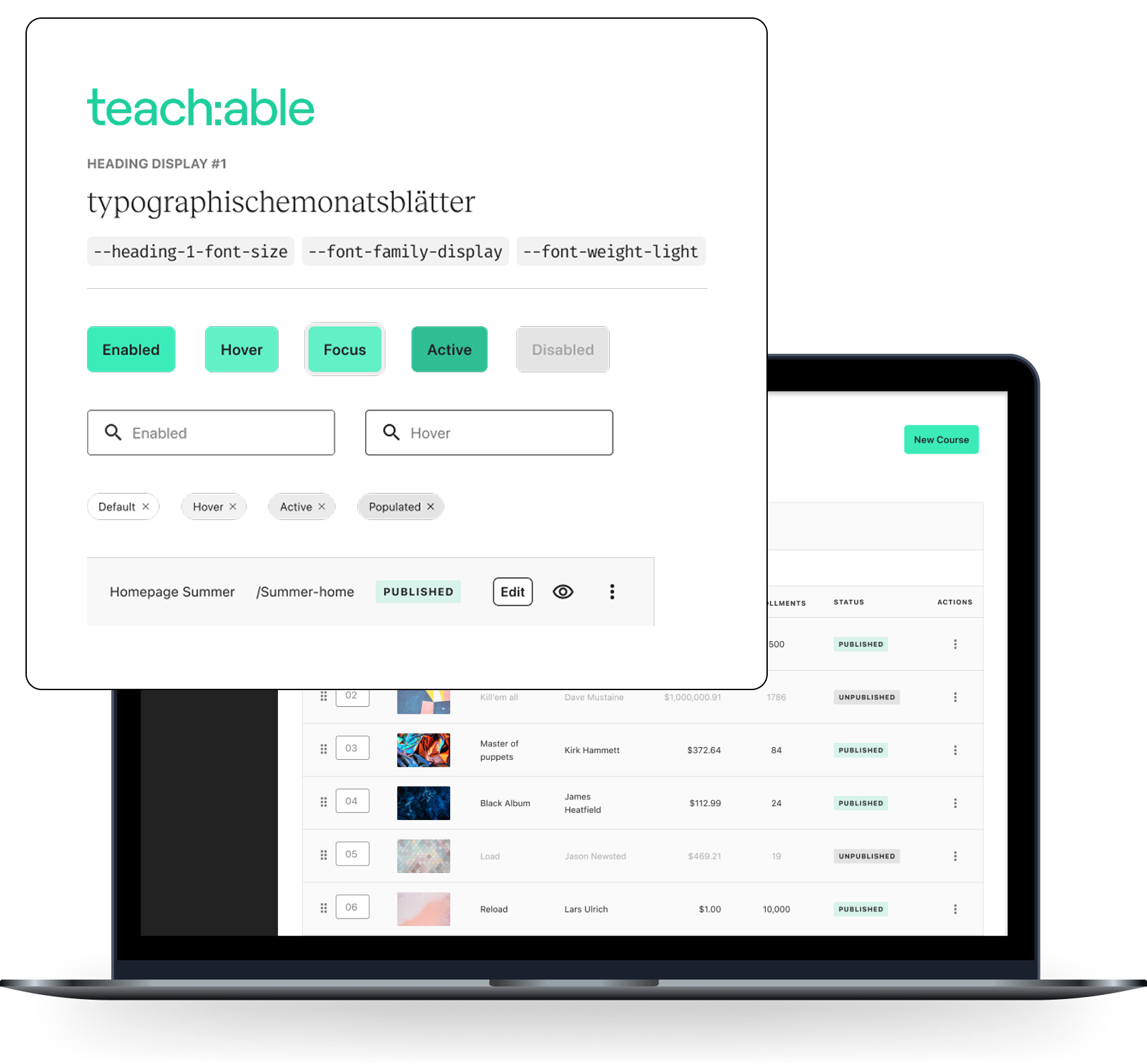
2. Component Consolidation
After identifying fragmentation, we began consolidating overlapping components into a unified system architecture.
Components were reviewed based on:
- Usage frequency
- Complexity
- Dependency relationships
- Business impact
This process reduced redundancy and established a cleaner, more scalable component structure.
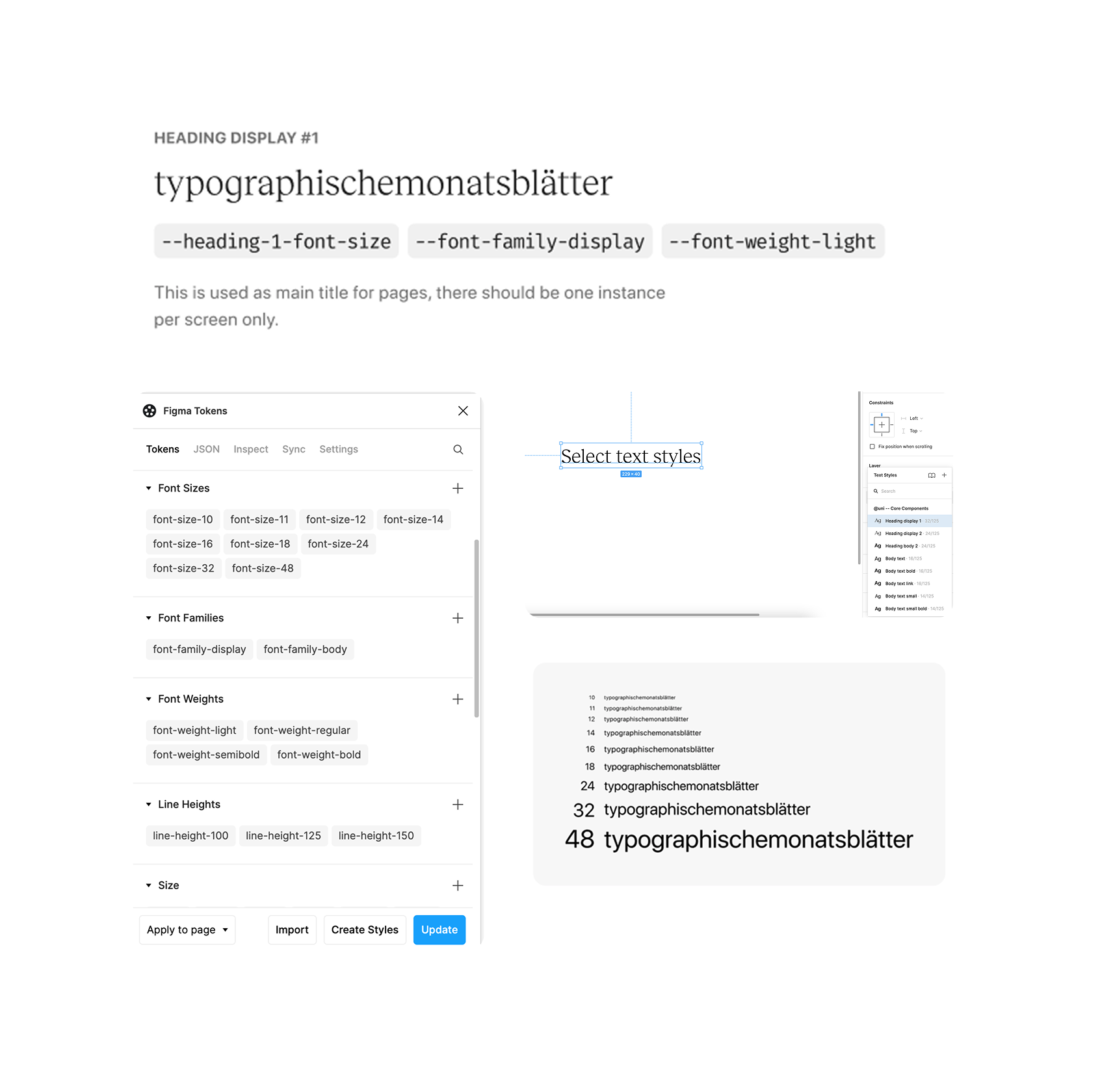
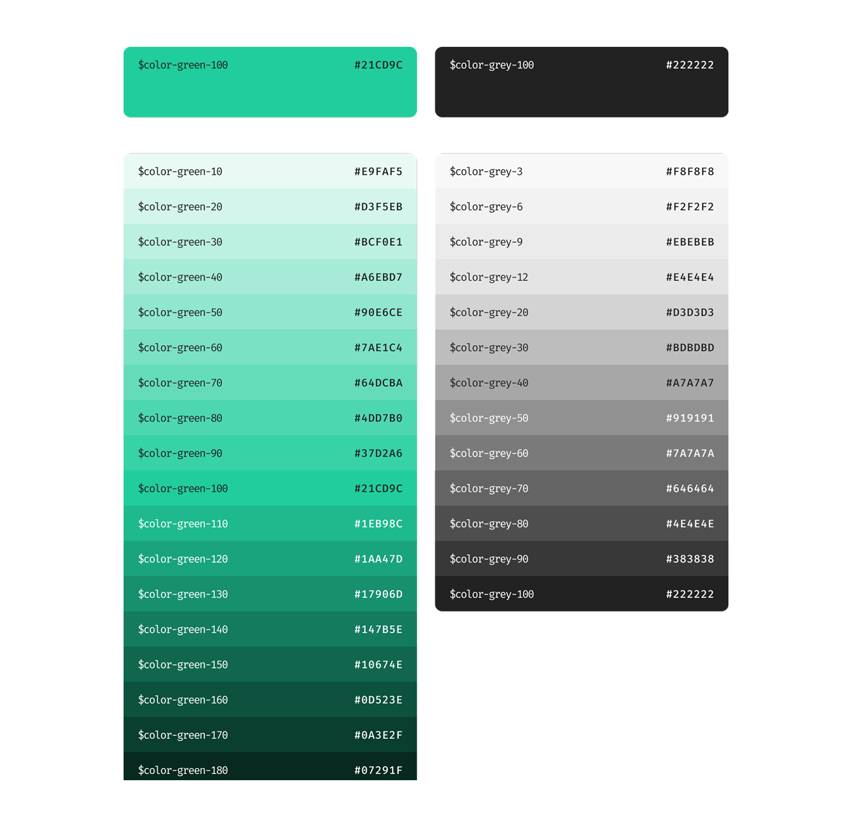
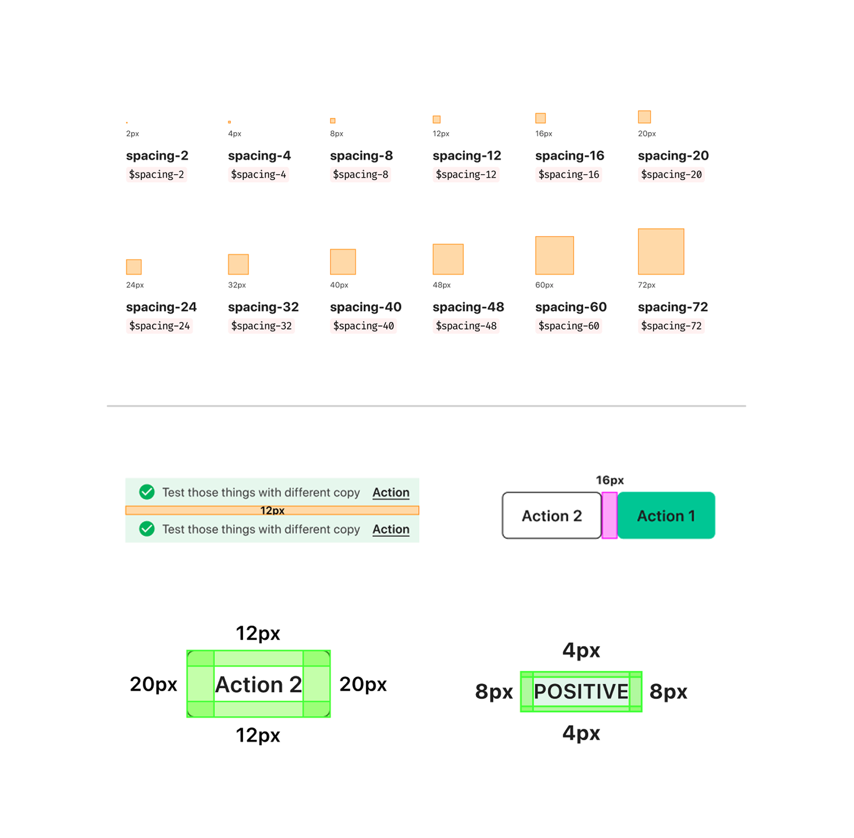
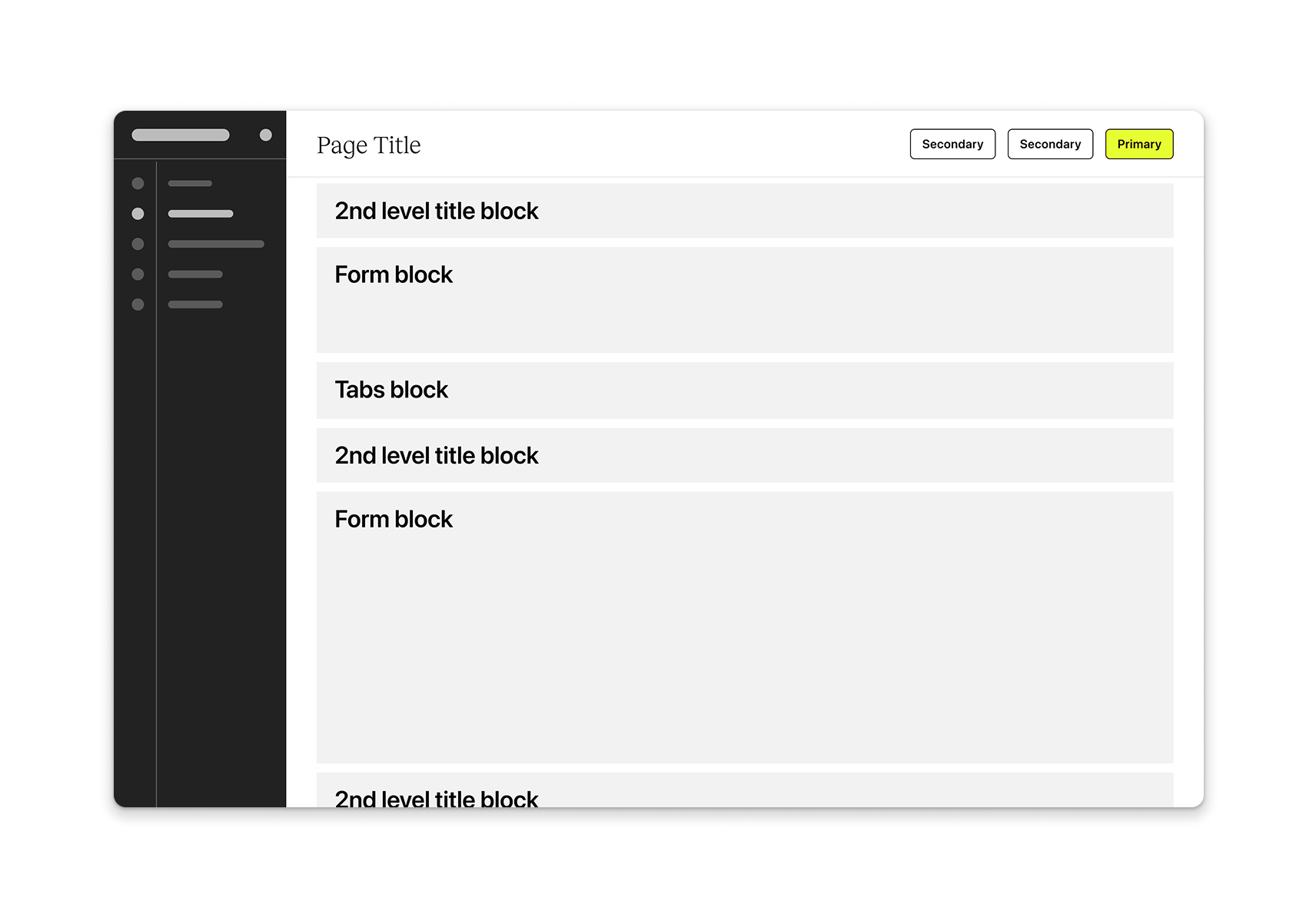
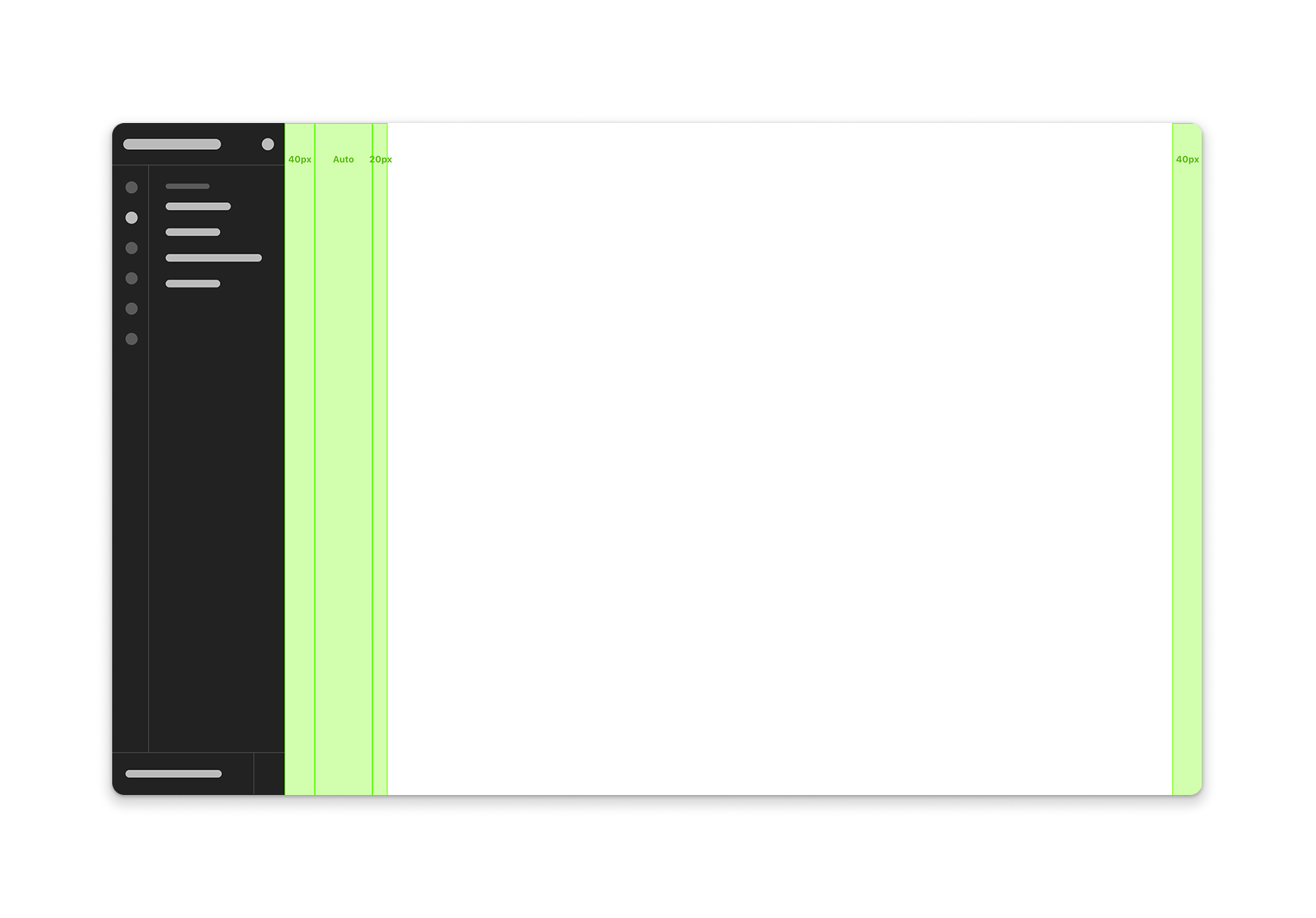
3. System Architecture & Documentation
We restructured the Design System around clear foundations and component categories, improving discoverability and ease of adoption.
Key areas included Foundations (Colors, Typography, Spacing, Tokens, Icons) and Components (Inputs, Navigation, Data Display, Feedback Patterns).
This improved documentation clarity for both designers and engineers.
Governance & Communication
A Design System can only scale when ownership and decision-making are clear.
To support long-term sustainability, we helped define a governance model covering:
- Contribution workflows
- Approval processes
- Ownership boundaries
- Release management
We also introduced dedicated communication channels between design and engineering to streamline feedback, prioritize requests, and improve system adoption.
This transformed the Design System from a static library into a living product capability.
Outcomes
- Improved consistency across product experiences
- Better collaboration between design and engineering
- Faster component discovery and reuse
- Clearer ownership and contribution workflows
- More scalable system maintenance
Services Provided
- Design System Audit
- Component Consolidation
- Information Architecture
- Documentation Strategy
- Design Tokens
- Governance Model
- Adoption Strategy
- Cross-functional Alignment